Business Flyer
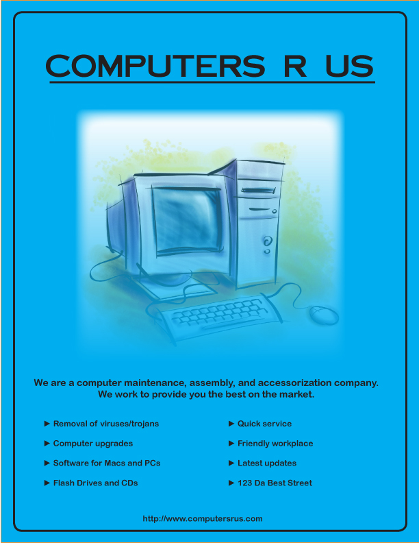
The design for my business flyer was created for a fictional computer company. The logo in the middle is there because it is relevant tothe company and keeps the flyer froom looking very plain. The company's name is at the top, and was typed using a sophisticated looking font to add eye appeal. I believe it is appropriate for a company as well. The company's main information is at the bottom of the page. The website url is at the very bottom because as the article linkedon the project overview explained, the last thing people usually remember is the last thing they read. The text explains the range of things the company can help customers with which is what readers need to know about. The two lines above it help to summarize the company's purpose, almost like a slogan or motto would.